Data Visualizations
Explore the Digital Battlefield: Real-Time Cyber Threat Visualization by CheckPoint Security. Witness threats in action. Stay informed, stay protected.
Major Breach Visualizations
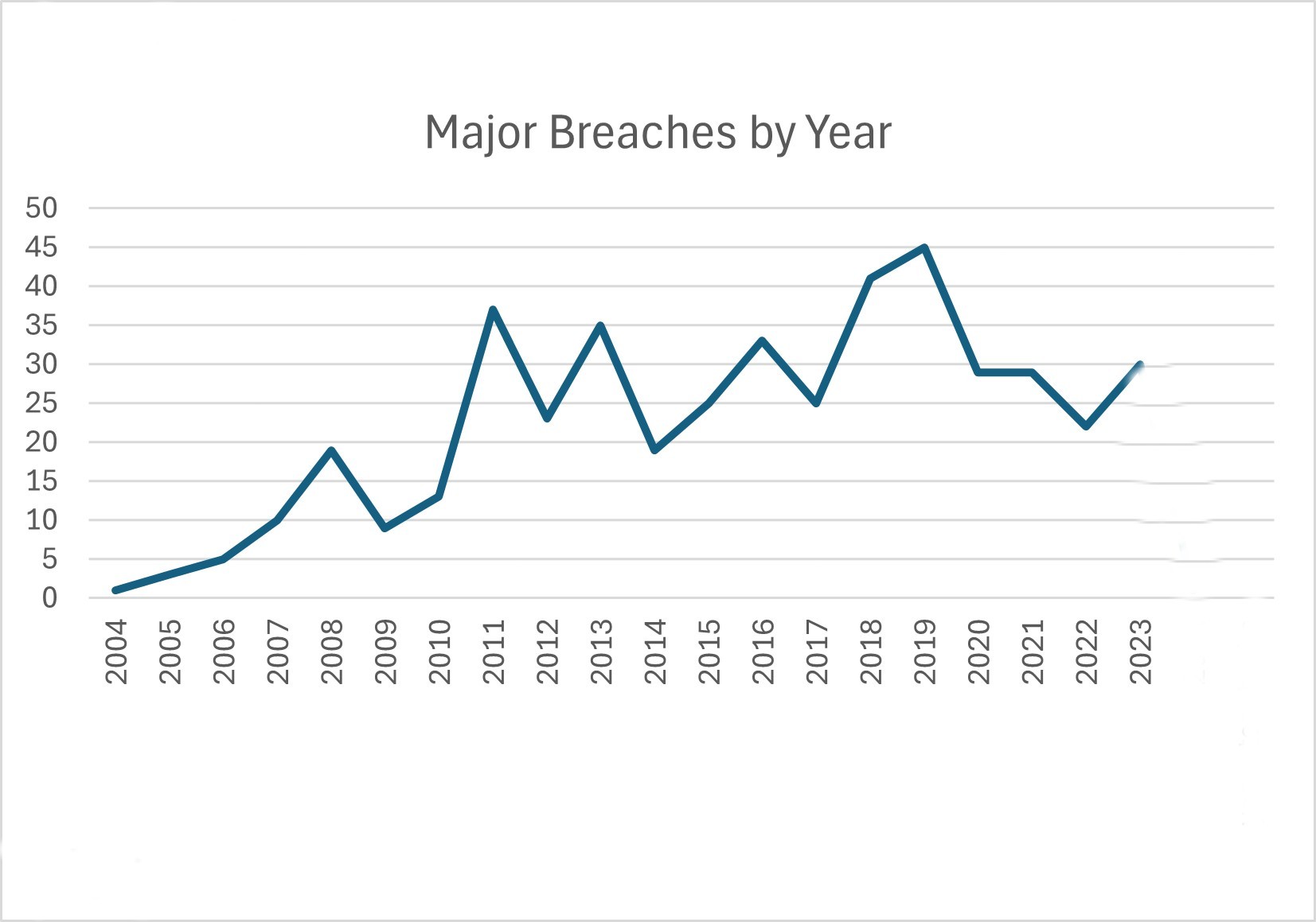
The first chart shows the number of significant data breaches per year from 2004 to 2021, highlighting the alarming rise in incidents.
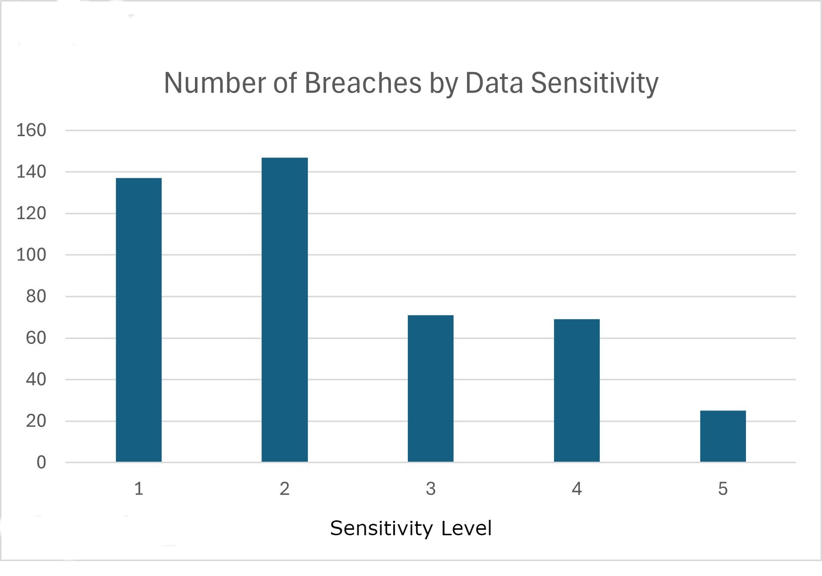
The second chart categorizes these breaches by the sensitivity of the data compromised, using a scale from 1 to 5:
This underscores how breaches increasingly expose our most private information. The data is sourced from the Center for Strategic and International Studies (CSIS) and data visualization expert David McCandless.
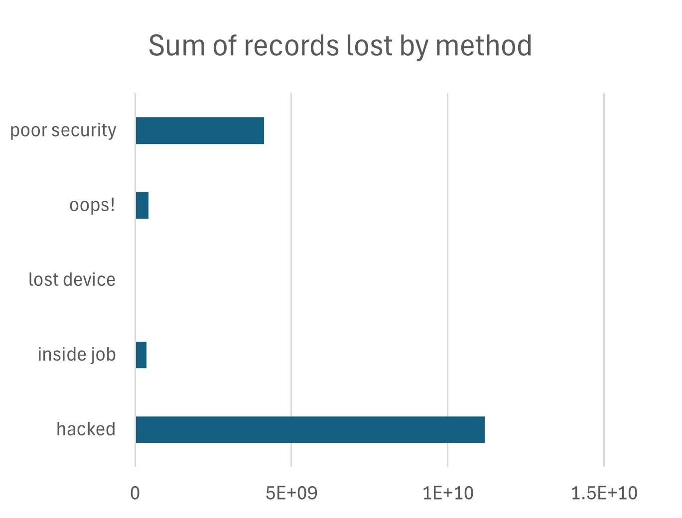
The third chart breaks down the share of records lost by the method of breach, such as hacking, poor security, inside jobs, and lost/stolen media and devices. This provides insight into common vulnerabilities. Here you can see that over 10 BILLION records have been exposed since 2004 as a result of hacking. The next most consequential method was poor security, exposing almost 1 billion records.